Previous |
Next |
Write code using component container and layout manager classes of the java.awt package to present a GUI with specified appearance and resize the behavior and distinguish the responsibilities of layout managers from those of containers.
The objectives of the JDK1.4 exam does not cover any GUI related objectives, but I have included this text for those studying for the JDK1.2 exam. Although it does not mention it specifically this objective involves a new objective compared with the 1.1 exam. This is the GridBaglayout It makes sense to cover this as it is a very useful LayoutManager, but because of its power it can take some learning.
Java uses a different philosophy to layout compared with tools
such as Visual Basic or Delphi (if philosophy is not too grand an
expression for laying out a program). Most design tools use an XY
pixel based approach to placing a component. Thus in Visual Basic
you can pick up a text box from the component palette and drop it
at a location on a form, and its location is set. By contrast Java
uses Layout classes to control where a component is placed
according to the current screen.
Part of the reason for this is the cross platform nature of Java. A
Java applet may display on anything from a palm top computer to a
19 inch Sun Workstation. I have tried writing Visual Basic
applications that take account of more than one screen resolution
and it is not a trivial activity. Be warned, if you have a
background in other RAD tools you may find the Layout Manager
approach a little weird at first.
The FlowLayout manager is a good place to start as it is the
default for Applets. The FlowLayout manager simply places
components on a background one after the other from left to right.
If it runs out of space to the right it wraps around the components
to the next line.
The following code creates a very simple application and adds a
series of buttons
import java.awt.*;
public class FlowAp extends Frame{
public static void main(String argv[]){
            FlowAp fa=new FlowAp();
            //Change from BorderLayout default
            fa.setLayout(new FlowLayout());
            fa.setSize(400,300);
            fa.setVisible(true);
    }

    FlowAp(){
                add(new Button("One"));
                add(new Button("Two"));
                add(new Button("Three"));
                add(new Button("Four"));
                add(new Button("Five"));
                add(new Button("Six"));
                add(new Button("Seven"));
                add(new Button("Eight"));
                add(new Button("Nine"));
                add(new Button("Ten"));
        }//End of constructor
}//End of Application
The following image is the default appearance when you fire it up from the command line.

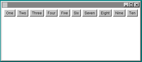
Bear in mind that both images are the display for exactly the
same Java code. The only thing that has changed is the width. The
FlowLayout manager automatically changes the layout of the
components when the Frame is re-sized. If you were to make the
Frame very small the FlowLayout manager would change the layout so
that the buttons were wrapped around in several rows.
When you first come across this approach to the management of
components it may seem a little arbitrary. Some of the GUI building
tools such as Symantec Visual Cafe or Borland/Inprise JBuilder
offer ways of specifically placing components. For the purposes of
the exam though you must become familiar with the Layout Manager
approach to GUI creation.
For the exam you need to know the following layout managers
FlowLayout
BorderLayout
GridLayout
GridBagLayout
(note: the first editions of the Roberts, Heller and Ernest book on certification say you do not need to know about the GridBagLayout, but this has been corrected in the online errata, see my FAQ)
Containers and Layout Managers work in partnership. The LayoutManager generally controls where a component is positioned. A Container will control the default font for its components. A component may be specifically assigned a font for itself. Questions on this seemed to come up regularly in the 1.1 exam. You were given a text description of a Component/Container setup and then asked what background color or font a Button or label would display.
If you add multiple components to a Container that uses the BorderLayout but do not pass a Constraint parameter (North, South, etc), you may get unexpected results. Here is a sample that illustrates this.
|
|
import java.awt.*;
public class FlowAp extends Frame{
public static void main(String argv[]){
    FlowAp fa=new FlowAp();
    // fa.setLayout(new FlowLayout());
    fa.setSize(400,300);
    fa.setVisible(true);
}

FlowAp(){
        add(new Button("One"));
        add(new Button("Two"));
        add(new Button("Three"));
        add(new Button("Four"));
        add(new Button("Five"));
        add(new Button("Six"));
        add(new Button("Seven"));
        add(new Button("Eight"));
        add(new Button("Nine"));
        add(new Button("Ten"));
    }//End of constructor

}//End of Application
|
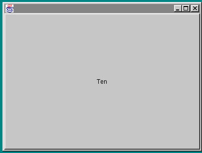
The reason you get this unexpected big button in the center is that the BorderLayout uses a set of coordinates when arranging components. It divides its surface area up into
North
South
East
West
Center
You might guess that the default when laying out components would be for them to be placed clockwise around the points of the compass or some such arrangement. Instead the designers decided to make the default the center of the layout area. Thus in this example every button has been laid out on the previous button, taking up the entire available area. As a result it appears that you only have one button, the last one added.
Because the BorderLayout only divides the area up into the five
mentioned coordinates it is not the most useful of Layout Managers.
However you need to be aware of it for the exam and you need to be
aware of the way it defaults to placing all components in the
center.
The GridLayout manager does approximately what you might expect. It divides the surface area up into a grid and when you add components it places them one after the other from left to right, top to bottom. Unlike the BorderLayout and FlowLayout it ignores any preferred size of the component. For example the preferred size of a button will be wide enough to show its text. The FlowLayout manager attempts to ensure that a button is this preferred size. The GridLayout has a more bondage and discipline approach. The only thing it cares about is making sure the component fits into the grid.
The following code lays out a set of buttons within a Frame using a GridLayout that has been set up to have 2 rows and 5 columns.
import java.awt.*;

public class GridAp extends Frame{
public static void main(String argv[]){
        GridAp fa=new GridAp();
        //Setup GridLayout with 2 rows and 5 columns
        fa.setLayout(new GridLayout(2,5));
        fa.setSize(400,300);
        fa.setVisible(true);
    }

GridAp(){

        add(new Button("One"));
        add(new Button("Two"));
        add(new Button("Three"));
        add(new Button("Four"));
        add(new Button("Five"));
        add(new Button("Six"));
        add(new Button("Seven"));
        add(new Button("Eight"));
        add(new Button("Nine"));
        add(new Button("Ten"));
        }//End of constructor

}//End of Application
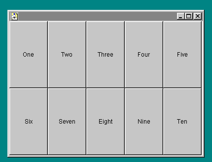
Note how the buttons are enlarged to fill all of the available space.
Peter van der Linden in Just Java and Beyond 3rd Edition describes the GridBagLayout manager as "excessively complicated " and doesn't recommend it. Core Java merely says "using grid bag layouts can be incredibly complex". Whilst it is complex to use by hand, the various GUI tools such as VisualCafe, Visual Age, JBuilder etc etc make it easier to use, if not understand. Thus JBuilder will happily modify the add statement to include the following details for the GridBagLayout class.
add(pAps,new GridBagConstraints2(1,
GridBagConstraints.RELATIVE,
GridBagConstraints.RELATIVE, 3, 0.0,
0.0,GridBagConstraints.CENTER,
GridBagConstraints.NONE, new Insets(0, 0, 0, 0), -3, 45));
But when you create your code by hand it does not need to look as complex as this.
Feedback from people who have taken the exam indicates that the questions on the GridBagLayout are not very in-depth and a basic understanding of the various fields of the GridBagConstraints class may well be adequate.
My favorite Java Tool is Borland/Inprise JBuilder which has its own Layout Manager called the XYLayout manager. This seems to be easier to use than the GridBagLayout, but if you are writing for the net it would require users to download that additional class, causing additional overhead.
GridBagLayout is a little like the GridLayout except that different cell rows can have different heights, and columns can have different widths. The Java2 Docs come with a demonstration applet that shows what can be done with the GridBagLayout manager.
In the exam this is a prime moment to take advantage of the scrap paper to write out a grid and consider the effect of each cell. One of the problems with the GridBagLayout is that instead of being based strictly on the underlying grid, Java tries to guess the cells from the information given. The GridBagLayout manager uses a helper class GridBagConstraints which has a set of member variables that can be set to affect the appearance of each component. The fields that you modify on the GridBagConstraints class act as "suggestions" as to where the components will go. An instance of GridBagConstraints is passed as a parameter with the add method, in the form
add(component, GridBagConstraint);
GridBagConstraints goes against the general convention in Java in that you might expect its attributes to be configured with
setFooParam()
methods, where FooParam might be WeightX/Y or Padding between components.
Instead it takes the form
GridBagLayout gbl=new GridBagLayout();
gbl.weightx=100;
If you use the GridBagLayout without the GridBagConstraints class it acts a little like a FlowLayout, simply dropping the components onto the background one by one.
I have created a simple demonstration applet with source that shows how nothing much happens unless you play with the GridBagConstraints class..
http://www.software.u-net.com/Applets/GridBagDemo/GridBagTest.htm
The GridBagLayout acts a little more like the GridLayout if you use the GridBagConstraints class and use the gridx and gridy fields to assign a position in a "virtual" grid to each component as you add it. This applet demonstrates this possibility. This is still a little dull and very like the other layout managers. Things start to get much more interesting when you start to modify other fields of the GridBagConstraints class to modify the appearance of different components within this "virtual" grid.
Remember that although you need to understand this for the purposes
of the exam, it might be easier when programming in the real world
to use a combination of container controls added with other layout
managers. An example of when this is not an option is when you need
to dynamically re-size components. This is a situation where GUI
builders such as Visual Cafe or JBuilder are not much help and an
understanding of the GridBagLayout may be essential.
I have created a demonstration applet that shows the affect of dynamically changing the padding parameters for a single button in a group of buttons set out with a GridbagLayout manager
The fields for the GridBagConstraints class are
gridx gridy
gridwidth and gridheight
fill
ipadx and ipady
insets
anchor
weightx and weighty
Whilst browsing Bill Brogdens excellent Java2 Exam Cram Book I found a pointer to a comprehensive demo of the GridBagLayout at
www.austria.eu.net/java/programs/applets/missgable/index.htm
For this example you are doing some basic code to design a appointment calendar program. It will show times down the left hand side and appointment details down the right. The time units will be in half hour chunks.
Because an appointment may cover more than one time unit, ie may
last an hour and a half you need to be able to dynamically change
the height of an appointment to cover more than one half hour time
unit. Because of this requirement to have a varying height for the
appointments, a GridLayout is not suitable.
You will be placing panels on the Frame as containers. The first
step is to ensure that each panel sits side by side on the main
Frame of the Application.
import java.awt.*;
import java.awt.event.*;

public class GBCal extends Frame{
    Panel pTimes=new Panel();
    Panel pAps=new Panel();
    TextField txTimes=new TextField("09.00");
    TextField txAps=new TextField("Meet the boss");
    GridBagLayout gbl=new GridBagLayout();
    GridBagConstraints gbc=new GridBagConstraints();
    public static void main(String argv[]){
    GBCal gbc=new GBCal();
    gbc.setLayout(new FlowLayout());

}

public GBCal() {
    pTimes.add(txTimes);
    pAps.add(txAps);
    setLayout(gbl);
    gbc.gridx=0;
    gbc.gridy=0;
    pTimes.setBackground(Color.pink);
    add(pTimes,gbc);
    gbc.gridx=1;
    gbc.gridy=0;
    pAps.setBackground(Color.lightGray);
    add(pAps,gbc);
    setSize(300,300);
    setVisible(true);
    }

}
The output will appear as follows
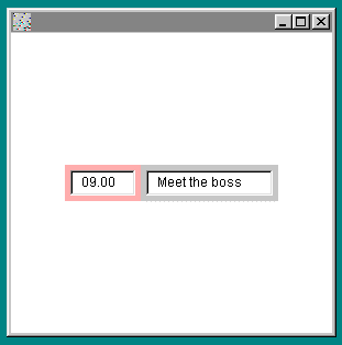
Note how the GridBagLayout and the GridBagConstraints classes work together. The GridBagConstraints instance gbc gets re-used for each time a component is added. At no point do you specifically state the number of rows and columns for the Grid as the GridBagLayout class deduces it from the gridx and gridy fields of the GridBagConstraints instance.
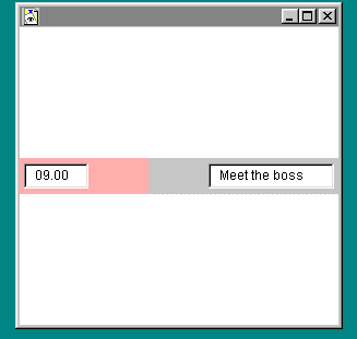
The code has set the background color so you can see the extent of
the panel rather than simply the width of the text fields. This is
fine but now you want the fields to stretch all the way from left
to right of the main application Frame. This can be performed by
modifying the ipadx field of the GridBagConstraints class.
This is peformed by setting
gbc.ipadx=30;
For the times and
gbc.ipadx=100;
For the appointments
The result is as follows
For the next step I want to give each panel its own
GridBagLayout manager and add additional time slots and
appointments. For the purpose of this example I will add just one
more time slot and simply stretch the single appointment to cover
the time slots between 9.00 and 9.30.
To do this I will create a new instance of GridBagLayout called
gbBut and use it to set up the grid for the pTimes
panel to place the time slot fields one on top of the other
vertically.
The code that performs this is
//Control the Times panel with a GridBagLayout

pTimes.setLayout(gbBut);
gbc.gridx=0;
gbc.gridy=0;
pTimes.add(txTimes9,gbc);
gbc.gridx=0;
gbc.gridy=1;
pTimes.add(txTimes930,gbc);
Here is the complete code to the revised program
import java.awt.*;
import java.awt.event.*;
public class GBCal extends Frame{
Panel pTimes=new Panel();
Panel pAps=new Panel();
TextField txTimes9=new TextField("09.00");
TextField txTimes930=new TextField("09.30");
TextField txAps=new TextField("Meet the boss");
GridBagLayout gbl=new GridBagLayout();
GridBagLayout gbBut=new GridBagLayout();
GridBagConstraints gbc=new GridBagConstraints();
public static void main(String argv[]){
    GBCal gbc=new GBCal();
    gbc.setLayout(new FlowLayout());
    }

public GBCal() {
    setLayout(gbl);
    //Control the Times panel with
    //a GridBagLayout
    pTimes.setLayout(gbBut);
    gbc.gridx=0;
    gbc.gridy=0;
    pTimes.add(txTimes9,gbc);
    gbc.gridx=0;
    gbc.gridy=1;
    pTimes.add(txTimes930,gbc);
    pTimes.setBackground(Color.pink);
    //Re-using gbc for the main panel layout
    gbc.gridx=0;
    gbc.gridy=0;
    gbc.ipadx=30;
    add(pTimes,gbc);
    pAps.setLayout(gbBut);
    gbc.gridx=0;
    gbc.gridy=1;
    pAps.add(txAps,gbc);
    gbc.gridx=1;
    gbc.gridy=0;
    gbc.ipadx=100;
    pAps.setBackground(Color.lightGray);
    add(pAps,gbc);
    setSize(300,300);
    setVisible(true);
    }
}//End of class
The resulting output is as followed
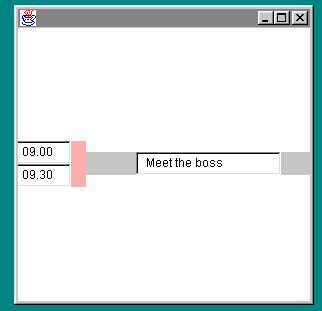
This has worked up to a point. We now have the two time slots, but unfortunately the one appointment has defaulted to the centre of the appointments field and it is only one row thick. What I want is for it to be anchored at the top of the appointments area and to stretch to cover both time slots.
f a component does not fill the whole area, you can specify where in the area you want it using the anchor field of the GridBagConstraints class. The possible values are
GridBagconstraints.CENTER
GridBagconstraints.NORTH
GridBagconstraints.NORTHEAST
etc etc
In this case I want to position the fields at the top (North) of the containing panels. I have increased the depth of the Appointment field by increasing the ipady value for the address field.
Here is the code to do this.
import java.awt.*;
import java.awt.event.*;
public class GBCal extends Frame{
Panel pTimes=new Panel();
Panel pAps=new Panel();
TextField txTimes9=new TextField("09.00");
TextField txTimes930=new TextField("09.30");
TextField txAps=new TextField("Meet the boss");
GridBagLayout gbl=new GridBagLayout();
GridBagLayout gbBut=new GridBagLayout();
GridBagConstraints gbc=new GridBagConstraints();

public static void main(String argv[]){
        GBCal gbc=new GBCal();
        gbc.setLayout(new FlowLayout());
    }

public GBCal() {
    setLayout(gbl);
    //Control the Times panel with a GridBagLayout
    pTimes.setLayout(gbBut);
    //Ensure the componants sit at
   //the top of the containers
    gbc.anchor=GridBagConstraints.NORTH;
    gbc.gridx=0;
    gbc.gridy=0;
    pTimes.add(txTimes9,gbc);
    gbc.gridx=0;
    gbc.gridy=1;
    pTimes.add(txTimes930,gbc);
    pTimes.setBackground(Color.pink);

    //Re-using gbc for the main panel layout
    gbc.gridx=0;
    gbc.gridy=0;
    gbc.ipadx=30;
    add(pTimes,gbc);
    pAps.setLayout(gbBut);
    gbc.gridx=0;
    gbc.gridy=1;
    gbc.ipady=12;
    pAps.add(txAps,gbc);
    gbc.gridx=1;
    gbc.gridy=0;
    gbc.ipadx=100;
    pAps.setBackground(Color.lightGray);
    add(pAps,gbc);
    setSize(300,300);
    setVisible(true);
    }

}//End of class
The output of this code is as follows
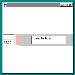
This exercise has covered the following GridBagConstraints fields
ipadx/y
gridx/y
anchor
The GridBagConstraints class has the following important fields
weightx/y
fill
gridwidth/height
insets
The weight fields control how an area grows or shrinks beyond its initial size. So if you set the weighty field to zero the field will remain a constant height when you resize the window.
The fill field controls how a component stretches to fill the area. Like the anchor field you set the fill values using constants of the GridBagConstraints class. These are
GridBagConstraints.NONE
GridBagConstraints.HORIZONTAL
GridBagConstraints.VERTICAL
GridBagConstraints.BOTH
The gridwidth/height fields determine how many columns and
rows a component occupies.
The insets field indicates the "external" padding along the cell boundaries.

What best describes the appearance of an applet with the following code?
import java.awt.*;
public class FlowAp extends Frame{
public static void main(String argv[]){
    FlowAp fa=new FlowAp();
    fa.setSize(400,300);
    fa.setVisible(true);
}

FlowAp(){
        add(new Button("One"));
        add(new Button("Two"));
        add(new Button("Three"));
        add(new Button("Four"));
    }//End of constructor

}//End of Application
1) A Frame with buttons marked One to Four placed on each
edge.
2) A Frame with buutons Marked One to four running from the top to
bottom
3) A Frame with one large button marked Four in the Centre
4) An Error at run time indicating you have not set a
LayoutManager
How do you indicate where a component will be positioned using Flowlayout?
1) North, South,East,West
2) Assign a row/column grid reference
3) Pass a X/Y percentage parameter to the add method
4) Do nothing, the FlowLayout will position the component
How do you change the current layout manager for a container
1) Use the setLayout method
2) Once created you cannot change the current layout manager of a
component
3) Use the setLayoutManager method
4) Use the updateLayout method
What will happen if you add a vertical scroll bar to the North of a Frame?
1) The Frame will enlarge to allow the scrollbar to become its
preferred size
2) It will be wide, fat and not very useful
3) You cannot add a vertical scroll bar to the North of a frame,
only the East or West
4) The scrollbar will stretch from the top to the bottom of the
Frame
What happens if you add more buttons to a GridLayout than can fit and and fully display the button labels?
1) The size of the container is increased to allow the button
labels to fully display
2) The GridLayout ignores the size of the label and the labels will
be truncated
3) A compile time error indicating the Buttons cannot be the
preferred size
4) A run time error indicating the buttons cannot be the preferred
size.
Which of the following statements are true?
1) You can control component placing by calling setLayout(new
GridBagConstraints())
2) The FlowLayout manager can be used to control component placing
of the GridBagLayout
3) The GridBagLayout manager takes constraints of North, South,
East, West and Center
4) None of these answers is true
Which of the following are fields of the GridBagConstraints class?
1) ipadx
2) fill
3) insets
4)width
What most closely matches the appearance when this code runs?
import java.awt.*;
public class CompLay extends Frame{
    public static void main(String argv[]){
    CompLay cl = new CompLay();
    }

CompLay(){
    Panel p = new Panel();
    p.setBackground(Color.pink);
    p.add(new Button("One"));
    p.add(new Button("Two"));
    p.add(new Button("Three"));
    add("South",p);
    setLayout(new FlowLayout());
    setSize(300,300);
    setVisible(true);
    }

}
1) The buttons will run from left to right along the bottom of
the Frame
2) The buttons will run from left to right along the top of the
frame
3) The buttons will not be displayed
4) Only button three will show occupying all of the frame
Which statements are correct about the anchor field?
1) It is a field of the GridBagLayout manager for controlling
component placement
2) It is a field of the GridBagConstraints class for controlling
component placement
3) A valid settting for the anchor field is
GridBagConstraints.NORTH
4) The anchor field controls the height of components added to a
container
When using the GridBagLayout manahger, each new component requires a new instance of the GridBagConstraints class. Is this statement
1) true
2) false
3) A Frame with one large button marked Four in the Centre
If you do not specify a constraint any components added to a
Container with the BorderLayout will be placed in the centre. The
default layout for a Frame is the BorderLayout
4) Do nothing, the FlowLayout will position the component
1) Use the setLayout method
2) It will be wide, fat and not very useful
2) The GridLayout ignores the size of the label and the labels will be truncated
4) None of these answers is true
1) ipadx
2) fill
3) insets
2) The buttons will run from left to right along the top of the
frame
When the layout manager is changed to FlowLayout the default
BorderLayout no longer applies and the panel is placed at the top
of the Frame
2) It is a field of the GridBagConstraints class for
controlling component placement
3) A valid setting for the anchor field is
GridBagconstraints.NORTH
2) false
This topic is covered in the Sun Tutorial at
http://java.sun.com/docs/books/tutorial/uiswing/layout/using.html
Jan Newmarsh in Australia has created this page
http://pandonia.canberra.edu.au/java/xadvisor/gridbag/gridbag.html
Jyothi Krishnan on this topic at
http://www.geocities.com/SiliconValley/Network/3693/obj_sec8.html#obj25
Previous |
Next |